Wednesday, May 25, 2011

Lab #7: Census 2000/2010


In this lab we are able to connect US Census 2000 data to that of GIS. In doing this we are able to find and collect data from a secondary source and apply it to GIS. All of the maps represent data that was collected during the US Census in 2000. The data is divided according to the percentage of each race (Asian, Black or Some Other Race) that is concentrated by county. Thus, for the first map the data is divided according to the percentage of Asians living in each county. Through looking at the legend we are able to learn that the areas on the map in light blue represent areas with a low population density of Asians living in the United States. Colors represented in darker shades of blue represent higher percentages of population density. Thus, we are able to learn that there are high concentrations of Asian people living within the state  of California, Washington and in the upper East Coast. The highest percentage of Asians living within a county is that of 46% and it is represented by dark blue on the map. 

In the second map we have the distribution of African Americans living in the United States ranked by percent. Once again we can tell that the areas in light blue represent low population densities whereas areas in darker shades of blue represent higher population densities. From the map we can tell that there is a high concentration of African Americans living in the South in states such as Louisiana, Mississippi and Alabama just to name a few. A reason as to why there are high percentages of African Americans in the South might have to do with the history of the slave trade and the plantations that originated in the South. The highest percentage of African Americans concentrated in a single county is that of 86.4% and it is represented by the darkest shade of blue on the map.  

The last map shows us the distribution of "some other race" living in the United States ranked by percent. The light colors represent low population densities and the darker colors represent higher population densities. From the map we can tell that there are high concentrations of "some other race" on the western part of the United States particularly in areas such as California, Texas and Arizona. There is a high percentage of "some other race" as well in Southern California, particularly that of Los Angeles County. The highest percentage of some other race is that of 39% and it is represented by the darkest shade of blue. 

In addition, we can tell that there are large percentages of Asians, African Americans and "Some Other Race" in California, particularly in Los Angeles County. One of the reasons as to why this might be is due to all of the ethnic enclaves situated in Los Angeles as well as to the wonderful melting pot that Los Angeles is!

Tuesday, May 17, 2011

Lab #6: DEMs in ArcGIS


In this week's lab we are looking at digital elevation models or DEMs. DEMs contain an array of elevation measurements that are usually organized as squares or rectangular grids. DEMs help highlight locations with dramatic elevation changes such as mountains, volcanoes and canyons. 

The area of interest that I selected was that of the Malibu/Ventura area. The map highlights Point Mugu which is a naval base in Ventura County shown in the lower left part of the map. The lower right area of the map features Highway 23, which is also known as Decker Canyon. Inland we have the 101 freeway which passes through agricultural land in Fillmore, Moorpark and Oxnard. Along the coast section of the map runs Pacific Coast Highway (PCH). I chose this area of interest because I have grown up camping and surfing in this area. Thus, I was interested to see what it would look like in a DEM. There are also great hiking trails and canyons as well in this area which represent the changes of elevation present in this area. 

What I found most interesting in this DEM was the contrast in elevation from that of sea level to the Santa Monica Mountains which surround the area. In the shaded relief model the blue color represents low elevation, i.e. sea level and below sea level, and the yellow and red represent increases in elevation. The red represents the Santa Monica Mountains. Furthermore, in the Slope map we see that the slope is very steep and rapidly increases. It goes from being flat (green) to being very steep (red). Lastly, the 3D image of my location helps show the increase in elevation from sea level to that of areas of high elevation, i.e. mountains. The points of highest elevation are represented in dark blue. 

All in all, I found this to be a very interesting lab exercise because Digital Elevation Models can tell us many things. For example, by looking at the elevation of certain areas we can figure out what types of flora and fauna are present in these regions based on the types of elevations that they live in. This is just one of the few things that DEMs can tell us. 

Here is some additional information about my maps:

Extent: 
top: 34.29 degrees, left: -119.15 degrees, right: -118.74 degrees, bottom: 34.03 degrees

Geographic Coordinate System:
GCS North American 1983

Friday, May 13, 2011

Lab #5: Map Projections in ARCGIS


The focus of this week’s lab was that of map projections. A map projection can be defined as “the transformation of coordinate locations from the earth’s curved surface onto flat maps.” Basically map projections are ways in which three-dimensional bodies can be represented on a plane. There are three ways to project the earth onto a developable flat surface based on geometric shape: azimuthal (plane), cylindrical (cylinder) and conical (cone). Without map projections we would not be able to create maps. Maps help us transform the 3D world into a two-dimensional surface.
However, all map projections distort the surface in some fashion, as some properties are lost at the expense of the others. Every distinct map projection distorts each map in a unique way.  Some of the properties that are affected by this distortion include area, shape, direction (angles on the map), bearing, distance and scale. While it preserves some of these qualities others are compromised. By realizing how map projections distort reality an increase geographic awareness and map appreciation can be made.
Of the six map projections in this lab, two are classified as equal area, two are conformal and two are equidistant map projections.  Due to the fact that all projections result in some distortion of the earth, they are classified based on the properties that they maintain. Conformal projections preserve shape and area, equal area projections preserve area and equidistant projections preserve neither shape nor area but rather distance over a short area.
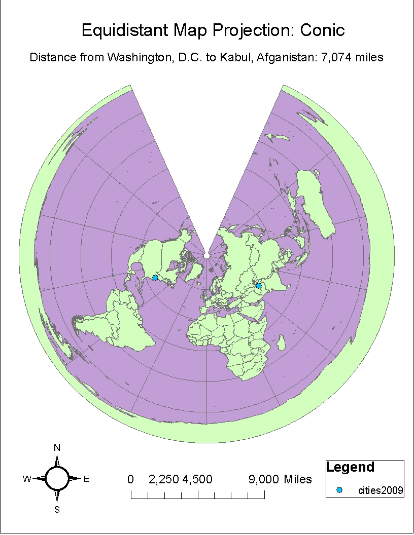
For my equal area maps I chose both the Mollweide and the Hammer-Aitoff projections. In both of these maps the area is preserved. For my equidistant projections I chose a Sinusoidal projection and a Conic projection. Both of these maps help preserve distance over a short area from a standard point or line. This can be seen in the fact that when comparing the two maps the distances from Washington, D.C to that of Kabul, Afghanistan do not differ by that many miles as seen in the other projections. The scale for these two maps is also the same, that of 9,000 miles. The Equidistant Conic Projection provides a “bird’s eye view” of the world resulting in a view from above.  In both of these equidistant projections the shape and area are not preserved and one can witness a sort of stretching. For the conformal projections I chose both a Mercator and a Gall Stereographic Projection. Both of these maps help preserve shape and area but not distance. This can be seen in that fact that the distance from Kabul to Washington D.C. varies the most in these 2 projections.
All in all, map projections are very useful no matter what their distortion. No map is 100% perfect but that does not take away from their usefulness. Depending on what your needs are will help you figure out what map is best for your specific project or needs.   

Thursday, May 5, 2011

Lab #4: Introducing ArcMap


In Lab #4 the students of Geography 7 at UCLA were introduced to ArcGIS. In this lab we learned how to use ArcMap and ArcCatalog, both of which are crucial elements to ArcGIS. Our finished product was a full-featured map that had a background, scale bars, title and legend just like most ordinary maps. However, the map that we created was in fact quite unique. Not only did it have these map essentials but it also represented different layers. These layers provide thematic information for forming a GIS map. In addition to forming layers, students also learned how to digitize maps as well as export data, work with attribute tables and add data, and manipulate a road. We have learned all of this in our very first tutorial, which started with the mere basics of how to open ArcMap and ArcCatalog and use the toolbar for simple tasks such as zooming in and out.

In working with GIS we have been exposed to some of the difficulties and pitfalls in working with ArcMap. Let me start off by saying that for someone who is technologically challenged this was quite a difficult lab to overcome. For someone like myself who is not very good with computers this lab proved to be very frustrating and time consuming. With practice it is supposed to get easier and faster but I have a feeling that it will take lots and lots of practice. I think that the most difficult task for me was properly saving my work. Due to the many drives (S, D, F drives) that we are working with it became quite difficult to make sure that my work was saved in the right folder so that I could work on it at a later time. I’m going to be honest; I’m still very confused on how to save my work to the right folder and to copy the files. This was a huge problem for me as I had assumed that I saved all of my work on the flash drive only to return to it not being there. Instead I was greeted by a whole bunch of red exclamation marks. This brings me to the conclusion that GIS is a very difficult field and is geared toward people who are tech savvy. I feel like GIS is not geared toward the everyday person but rather is geared to a specific audience. Yes, the tutorial was straightforward but along the way there are bumps in the road probably due to my unfamiliarity with the program. All of these bumps I took as learning experiences and I’m sure that with time and practice that understanding how to use ArcGIS will hopefully get better.

In addition to the pitfalls of ArcMap within GIS there are also many possibilities. The potential is overwhelming and it is with this potential that GIS has taken unsurpassed importance and popularity within the growing academic world. GIS can be used not only for geography and information technology but it can also be applied to urban planning, public health, environmental work and conservation just to name a few. GIS is also beneficial as it allows students, who previously probably would never have been exposed to this tool, the opportunity to learn a new skill. Knowing GIS and how to use it properly will be a very important skill for people to learn especially in this very competitive job market.  Maps created on ArcMap are unlike normal ordinary maps that we are used to. Rather, they are complex maps composed of different layers that have all been created from different data frames located within the geodatabase. What is also quite important is the expanse of this geodatabase. I found it absolutely amazing! GIS in the right hands is quite a powerful tool if utilized properly. Lastly, another thing that I noticed was that with time steps that had to be repeated became easier. Troubleshooting, and doing the steps over and over again until I got them right also helped in learned how to use basic tools on ArcMap.

All in all, ArcGIS has both pitfalls and great potential. In my opinion the possibilities are endless and outweigh the pitfalls. With the growing field of geography and its large expanse I believe that GIS will become an even more important tool for scholars to utilize. GIS is going and is having a large impact on geography and other disciplines of the like. In addition, with the emergence of neogeography GIS also has great potential. Everyday people and scholars are taking geography into their own hands and are changing the field forever. Currently, GIS is extremely expensive and therefore is only limited to a certain audience. However, with a growing interest in map making as seen on the internet with Google maps and mashups who knows what the future will bring to our society…only time will tell!

Thursday, April 21, 2011

Lab #3: Neogeography


View Santa Monica Beach Adventure! in a larger map

This mash-up map is a map that I created of Santa Monica, CA. I tend to spend most of my time during the summer working in Santa Monica and since I am unfamiliar with the area I thought that it would be a good idea to create a map with places that I could visit before or after work. I see Santa Monica as an extremely sustainable and fun city and I would like to get to know it better as a place that I can explore in my free time.


Neogeography

The field of neogeography is an up and coming phenomenon that is changing the face of geography. Neogeography can simply be defined as “new geography” and it is responsible for numerous changes that we see in the field of geography today. Neogeography gives untrained individuals the power to take map-making into their own hands, a concept that when thought about can be potentially dangerous. As quoted in an article about neogeography the author states that " Neogeography is about people using and creating their own maps, on their own terms and by combining elements of an existing toolset. Neogeography is about sharing location information with friends and visitors, helping shape context, and conveying understanding through knowledge of place" (Turner 2). However, as untrained individuals make their own maps it takes away from the power of cartographers and other professional mapmakers. Nonetheless, along with the dangers come many benefits as well.

Positive attributes of neogeography include a new found interest and appreciation for the field of geography. Many people who otherwise would not have engaged in map-making before are now embracing the tools and opportunities that neogeography has to offer. Everyday individuals are creating and sharing their own maps with millions of people around the world. In a sense these individuals have become geographers in their own unique ways. In addition, neogeography has increased the importance and use of maps for the everyday person. Maps are now used not solely for scientific research but for common day activities. For example, whenever I go to an unfamiliar place the first thing that I do is go onto Google maps or MapQuest to get a route so that I won’t get lost. In addition, I might even check out a couple interesting places and things to do in the area so that I can have fun in this new environment. Maps and mashups have provided individuals with the power to see and experience their own mental maps. In a sense it has made their visualization a physical reality.

Despite the advantages and new found potential for neogeography it also presents a very important danger that is worthy of major concern. The most important threat that neogeography poses is a threat to the validity of maps created by professionals. This has thus led to the creation of inaccurate and invalid maps that are sometimes viewed as the “real deal.” Thus, with people obtaining the power to create their own maps it unfortunately causes a serious problem in the academic field of geography. People using these maps for educational purposes must now pay special attention to the source of where they obtained their information. This is very much similar to students who write papers. Just about anything is now provided on the internet and it is important to check the source to make sure if it is from a valid source or not.

However, regardless of the dangers that neogeography offers I believe that the positive aspects of the field outweigh the concerns. Neogeography is still a growing field and it has a lot of room for improvement and proper oversight. I believe that the field of geography will gain importance and awareness with everyday people being given the opportunity of accessing geographic information. Education and awareness about geography will help geography continue and thrive as an academic field. It gives power to academic and non-academic people alike, giving them a small say in a large and growing interdisciniplinary field.

Thursday, April 14, 2011

Lab #2: USGS Topographic Maps


1. What is the name of the quadrangle? The name of the quadrangle is the "Beverly Hills, CA Quadrangle."
2. What are the names of the adjacent quadrangles? The names of the adjacent quadrangles are Canoga Park, Van Nuys, Burbank, Topanga, Hollywood, Venice and Inglewood.
3. When was the quadrangle first created? The quadrangle was first created in 1966.
4. What datum was used to create your map? The horizontal datum used to create this map is the North American Datum (NAD) of 1927 and the vertical datum used to create this map is the National Geodetic vertical datum of 1929.
5. What is the scale of the map? The scale of this map is 1:24,000
6. At the above scale, answer the following:
a) 5 centimeters on the map is equivalent to how many meters on the ground? 1/24,000 = 5 cm/x cm = 120,000 cm/1,000 = 1,200 meters
b) 5 inches on the map is equivalent to how many miles on the ground? 1/24,000 = 5 inches/x inches = 120,000 inches/63,360 inches = 1.89 miles
c) one mile on the ground is equivalent to how many inches on the map? 1/24,000 = x miles/1 mile = 0.00004167 miles x 63,360 inches = 2.64 inches
d) three kilometers on the ground is equivalent to how many centimeters on the map? 
1/24,000 = x km/3 km = 0.000125 km x 100,000 cm = 12.5 centimeters
7. What is the contour interval on your map? The contour interval on the map 20 feet.

8. What are the approximate geographic coordinates in both degrees/minutes/seconds and decimal degrees of:
a) the Public Affairs Building; 
34 degrees 4 minutes 26.17 seconds North, 118 degrees 26 minutes 20.75 seconds West or 34.073936 degrees N, 118.4391 degrees W
b) the tip of Santa Monica pier;
34 degrees 0 minutes 31 seconds North, 118 degrees 29 minutes 50.50 seconds West or 34.008611 degrees N, 118.49736 degrees W
c) the Upper Franklin Canyon Reservoir;
34 degrees 7 minutes 12.55 seconds North, 118 degrees 24 minutes 37.03 seconds West or 34.120153 degrees N, 118.41028611 degrees W
9. What is the approximate elevation in both feet and meters of:
a) Greystone Mansion (in Greystone Park);
570 feet or 173.736 meters
b) Woodlawn Cemetery;

140 feet or 42.672 meters
c) Crestwood Hills Park;

700 feet or  213.36 meters
10. What is the UTM zone of the map? The UTM zone of the map is Zone 11.
11. What are the UTM coordinates for the lower left corner of your map? The UTM coordinates for the lower left corner of the map are 3763000 northing and 361000 degrees easting. 
12. How many square meters are contained within each cell (square) of the UTM gridlines? Within each cell of the UTM gridline there are 1,000,000 square meters.
13. Obtain elevation measurements, from west to east along the UTM northing 3771000, where the eastings of the UTM grid intersect the northing. Create an elevation profile using these measurements in Excel (hint: create a line chart). Figure out how to label the elevation values to the two measurements on campus. Insert your elevation profile as a graphic in your blog.


14. What is the magnetic declination of the map? The magnetic declination of the map is 14 degrees east.
15. In which direction does water flow in the intermittent stream between the 405 freeway and Stone Canyon Reservoir? The water flows south in the intermittent stream between the 405 freeway and the Stone Canyon Reservoir. 
16. Crop out (i.e., cut and paste) UCLA from the map and include it as a graphic on your blog.


Wednesday, April 6, 2011

Lab #1: Interesting Maps

Hello! So for my first lab assignment I had to find three maps that were of interest to me. Go ahead and take a look below and I hope that they interest you as well!


Map #1: Map of Unprovoked Shark Attacks

The International Shark Attack File (http://www.flmnh.ufl.edu/fish/) has also built a very interesting map of the World's Confirmed Unprovoked Shark Attacks, from the year 1580 to 2009.
Map of World's Confirmed Unprovoked Shark Attacks from 1580 to 2009
TERRITORY TOTAL ATTACKS FATAL ATTACKS LAST FATALITY
USA (w/out Hawaii)
921
39
2008
Australia
358
134
2008
Africa
278
70
2004
Asia
117
52
2000
Pacific/Oceania Islands (w/out Hawaii)
125
51
2007
Hawaii
111
11
2004
South America
100
23
2006
Antilles & Bahamas
65
17
1972
Middle America
65
33
2008
New Zealand
47
9
1968
Europe
39
18
1984
Bermuda
4
0

Unspecified
21
7
1965
WORLD
2251
464
2008

This map was found on the Florida Museum of Natural History's webpage under the Ichthyology tab. This map displays data from all unprovoked shark attacks that occurred between 1580 to 2009. With the map there also comes a table which provides data as to the year when the last fatal shark attack occurred, how many attacks were fatal and how many total attacks occurred.  Looking at the map we can tell that the United States (not including Hawaii) is home to the most shark attacks, second is Australia and third is Africa. With the map and table we can come up with certain statistics about shark attacks that occur in the world. According to this map and data, the last fatal shark attack occurred in 2008 and about 20.6 percent of shark attacks from 1580 to 2009 were fatal. I believe that this map is important because it can provide researchers and everyday people with important statistics about shark attacks. Furthermore, I find this map interesting because I am an avid ocean visitor. I spend most of my free time at the beach enjoying the majestic environment that mother nature has to offer. Yet, deep beneath the surface there are creatures of the unknown, creatures that humans have to co-exist with, respect and take caution towards. I also find this map interesting because in my opinion it represents a clear and accurate distribution of world shark attacks. The map is easy for the viewer to observe and provides a table to explain its findings.

Map can be found at: http://www.surfertoday.com/images/stories/sharkattackmap.jpg


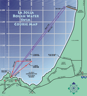
Map #2: La Jolla Rough Water Swim Course


This is a map of the La Jolla Rough Water Swim Course. This is an open water swimming event that is gaining popularity each year that it is held. There are three different courses held in this venue: the one mile course, the Gatorman (a three mile swim out to Scripps Pier and back) and the 800 yard course for the junior division. This swim takes place in the beautiful and ecologically diverse La Jolla Cove, located in San Diego County. If one is lucky one will be able to see bright orange Garibaldi fish, the occassional leopard shark, schools of fish and an abundance of sea grass swaying beneath with the tides. In addition to the marine life one may also get a very close view of their opponent's feet kicking thunderously throughout the water. La Jolla Rough Water Swim has over 1,000 participants and thus the tiny cove comes alive with eager swimmers ranging from ages 8 and under to 65 and over. I chose this map as one of my interesting maps because this is an ocean swim that I have been competing in for the last 4 years. It is always a highlight of my summer and provides a decent mini vacation down to San Diego. I also chose this map because for me I found it quite interesting to see what the course looked like from an aerial/map view. In La Jolla Cove, all one can see are the balloon buoy markers reflecting the distance yet from this map one is able to get a better visual of the actual race. 

Map can be found at: http://www.ljrws.com/Asset110.aspx?method=1


Map #3: Fallen Fruit of Echo Park
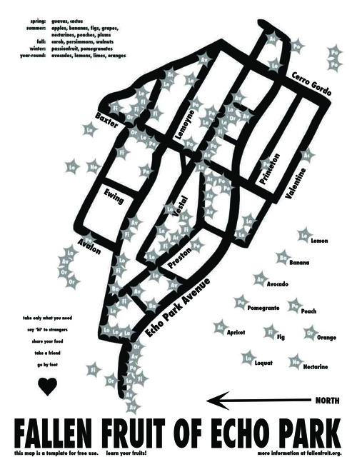
For my last interesting map, I chose a map of the "Fallen Fruit of Echo Park." In case you didn't know, Fallen Fruit is an organization that is based in certain cities all over the world but it is predominantly located in the United States. Locally there are 3 Fallen Fruit locations in Los Angeles including Venice Beach, Sherman Oaks and Echo Park. Fallen Fruit is an organization that creates art exhibits about local citizenship, neighborhood, community, and urban space in relation to fruit. This map, is a fruit map, which provides a map of all the fruit trees located in Echo Park that are participating in the program. Basically, these fruit trees are located in people's homes and are open to the public for picking. Fallen Fruit provides a sustainable practice so that uneaten fruit will not go bad and can be passed around the neighborhood for sharing. The variety of fruits range from season and place but as seen in the legend one will be able to find avocados, lemons and pomegranates in Echo Park just to name a few. I find this map interesting because I believe that the communal sharing of fruit trees leads to a more sustainable, closer knit community in which not only the fruit, but the people can grow. I myself have participated in using the Venice Beach Fallen Fruit map and have found it a very rewarding and fun experience.

Map can be found at: http://www.fallenfruit.org/wp-content/uploads/FallenFruitMap_EchoParkweb.pdf